Posted At: Jun 26, 2024 - 618 Views
CSS (Cascading Style Sheets) is like the wardrobe of your website, dressing it up in various styles to make it look appealing and organized. Initially, CSS was created to keep the content (the text and images) separate from the design (the colors, fonts, and layout). This separation gives developers more flexibility and control over how the website looks.
Over time, CSS has become more sophisticated, introducing powerful tools like Flexbox and Grid, which allow for complex and dynamic layouts.
Basic Concepts:
- Selectors: Think of these as the labels on clothes, telling you which element on the webpage you are styling.
- Properties and Values: These are the specific style instructions, like choosing a red color (
color: red) or setting a large font size (font-size: 20px). - Selectors; Selectors in CSS are patterns used to select the elements you want to style. There are various types of selectors:
Flexbox:
- Perfect for arranging items in a single line or column.
- Helps in aligning and distributing space within a container.
- Key properties:
display: flex,flex-direction,justify-content,align-items.
Grid:
- Ideal for creating intricate, two-dimensional layouts.
- Allows for easy placement of items into a structured grid.
- Key properties:
display: grid,grid-template-columns,grid-template-rows,grid-gap.
Advantages:
- Keeps content and design separate, making it easier to maintain.
- Flexbox and Grid simplify the creation of responsive and complex layouts.
- Enhances performance by managing styles more efficiently.
Usage Example CSS
.container {
    display: flex;
    justify-content: center;
    align-items: center;
}
.grid-container {
    display: grid;
    grid-template-columns: repeat(3, 1fr);
    grid-gap: 10px;
}
Element Selector: Targets HTML tags directly.CSS
p {
    color: blue;
}
Class Selector: Targets elements with a specific class attribute. CSS
.example {
    color: green;
}
Class Selector: Targets elements with a specific class attribute. CSS
.example {
    color: green;
}
ID Selector: Targets a single element with a specific ID attribute
#unique {
    color: red;
}
Properties and Values CSS properties are followed by their values and define specific styles for the selected elements.. CSS
h1 {
    font-size: 24px;
    color: black;
}
2. Flexbox
Flexbox (Flexible Box Layout) is a CSS layout model designed for laying out items in a one-dimensional space, either as a row or a column. Flexbox makes it easier to design a flexible responsive layout structure without using float or positioning.
Example HTML
<div class="flex-container">
    <div class="flex-item">1</div>
    <div class="flex-item">2</div>
    <div class="flex-item">3</div>
</div>

css

.flex-container {
    display: flex;
    justify-content: space-around;
    align-items: center;
}
.flex-item {
    background-color: lightcoral;
    padding: 10px;
    margin: 5px;
}
Key Properties of Flexbox:
display: flex;flex-direction: row | column;justify-content: flex-start | flex-end | center | space-between | space-around;align-items: flex-start | flex-end | center | stretch;
3. Grid
CSS Grid Layout is a two-dimensional layout system for the web. It allows developers to create complex layouts with a more straightforward and predictable approach compared to traditional methods like floats.
Example:
<div class="grid-container">
    <div class="grid-item">A</div>
    <div class="grid-item">B</div>
    <div class="grid-item">C</div>
    <div class="grid-item">D</div>
</div>
.grid-container {
    display: grid;
    grid-template-columns: repeat(3, 1fr);
    grid-gap: 10px;
}
.grid-item {
    background-color: lightblue;
    padding: 20px;
    text-align: center;
}
Key Properties of Grid:
display: grid;grid-template-columns: repeat(3, 1fr);grid-template-rows: auto;grid-gap: 10px;
4. Advantages
Separation of Content and Design CSS allows developers to separate the content from its presentation, making it easier to maintain and manage the design of a website. This separation improves the accessibility and readability of the code.
Simplified Responsive Design Flexbox and Grid significantly simplify the creation of responsive designs. They provide straightforward ways to align, distribute, and arrange items within a container, adapting seamlessly to different screen sizes.
Enhanced Performance By controlling the layout and styling more efficiently, CSS improves the performance of web pages. It reduces the need for complex JavaScript and extensive use of positioning and floats.
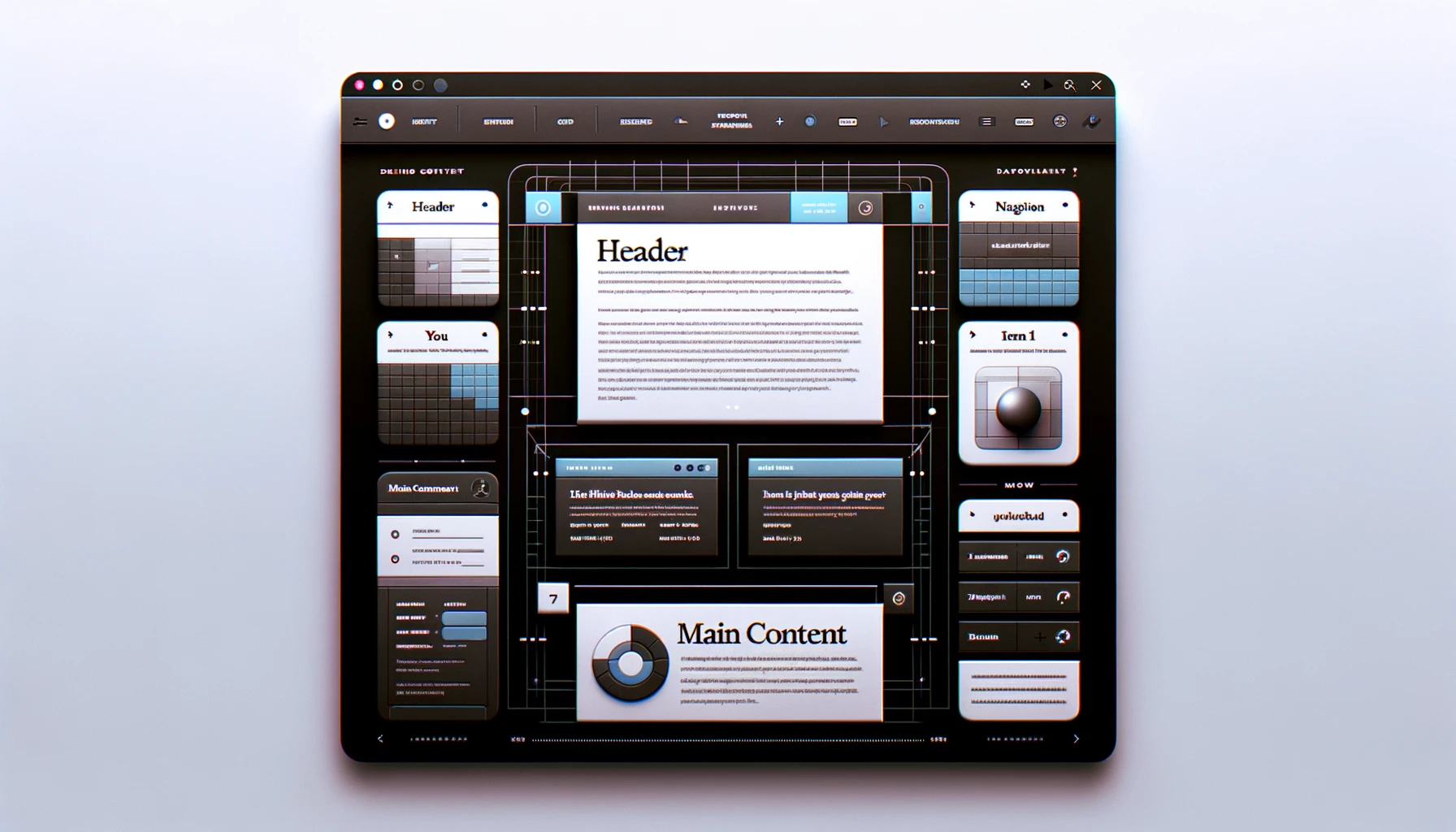
5. Usage Example
Combining Flexbox and Grid for a responsive layout:
<div class="page-container">
    <header class="header">Header</header>
    <nav class="nav">Navigation</nav>
    <main class="main-content">
        <section class="grid-section">
            <div class="grid-item">Item 1</div>
            <div class="grid-item">Item 2</div>
            <div class="grid-item">Item 3</div>
        </section>
    </main>
    <footer class="footer">Footer</footer>
</div>
.page-container {
    display: flex;
    flex-direction: column;
    min-height: 100vh;
}

.header, .footer {
    background: #333;
    color: #fff;
    text-align: center;
    padding: 1em;
}

.nav {
    background: #eee;
    padding: 1em;
}

.main-content {
    flex: 1;
    padding: 1em;
}

.grid-section {
    display: grid;
    grid-template-columns: repeat(auto-fit, minmax(200px, 1fr));
    grid-gap: 20px;
}

.grid-item {
    background: #ddd;
    padding: 20px;
    text-align: center;
}
Conclusion
CSS continues to be an essential technology in web development, constantly evolving to meet modern demands. Its advanced features like Flexbox and Grid empower developers to create complex, responsive, and visually appealing layouts with ease. Understanding and utilizing these features can significantly enhance the design and user experience of web applications.
For Enquiry, Click Here for WhatsApp Chat 
Call to Action
How do you think AI will shape the future of technology? Share your thoughts in the comments below. For more insights into the latest tech trends, visit our website PlambIndia and stay updated with our blog.
Follow Us
Stay updated with our latest projects and insights by following us on social media:
- LinkedIn: PlambIndia Software Solutions
We provide custom software solutions for every industry. Please contact us at Plambindia Software Solution.
Become a Client
Explore our diverse range of services and find the perfect solution tailored to your needs. Select a category below to learn more about how we can help transform your business.
Kuldeep Trivedi
plot no 1 / 2 suraj mall compound mal compound
+918766378125
contact@plambindia.com